Across the almost 50 posts of Downrange Data, I’ve disparaged PowerPoint in over a third of them — and I’m honestly surprised that wasn’t higher. I started off early, laying out why I think PowerPoint is holding us back. I genuinely believe leaders who rely on PowerPoint, keeping data at arm’s length, are why we haven’t embraced change across the army. They are why too many of our databases are crap, don’t talk to each other, and why the data software we do have is such garbage. Data illiterate commanders, easily marked out by always insisting on PowerPoint slides for every brief, are why human-machine teaming is still just a concept over a decade after we first announced Third Offset.1 While Ukraine has been developing ‘Uber for artillery’, we’re still stuck with ‘PowerPoint deep’ leadership.
But, as I near the end, it’s time I take a break from beating up on PowerPoint, and highlight what it is actually good for, like I promised I would four months ago.
Ok. Here goes.
PowerPoint is good for two things: Presentations and Drawing.
First, it’s actual intended purpose: presenting information. Released back in 1987, Robert Gaskins’ and Dennis Austin’s original intent was to give command over presentations to the speakers themselves, freeing workers from having to go through a separate art department to produce charts for them. That’s right, charts and slides and bullet points existed long before PowerPoint.
Edward Tufte is a famous critic of PowerPoint, with books on why it’s bad for your organization. Gaskins doesn’t dispute his arguments, ‘All the things Tufte says are absolutely true. People often make very bad use of PowerPoint.’ In fact, Gaskins and Dennis have joked ‘…that the best way to paralyze an opposition army is to ship it PowerPoint and, thus, contaminate its decision making, something some analysts say has happened at the Pentagon.’
Dammit, I’m doing it again. Ok, c-o-m-p-l-i-m-e-n-t PowerPoint.
PowerPoint is good for presentations.
If you use it correctly. Not every PowerPoint presentation is good.
First and foremost, are you actually presenting? If you’re having a meeting or a discussion, that’s not a presentation. Meetings aren’t Ted Talks; they’re about collaboration and communication. If you’re trying to change or decide something, PowerPoint should not be your go to. You’re better off just getting a white board.
Here’s a pro-tip to make your presentations more impactful. On top of being short, to the point, and rehearsed, consider these three components:
your read ahead
your actual presentation
your takeaway
Too often I see people in the army use the same thing for all three: PowerPoint slides. They just email their slides to the audience ahead of time, then print them out again as handouts for the briefing. These are almost always left on the table and not taken by the departing audience.
Start with your read ahead.
What does your audience need to know before they walk in the room? What’s going to set the scene? How can you give them the minimum vocabulary or competence they need to understand the rest of what you’re going to tell them? Aim for one single page of paper — it’s called a ‘white paper’. Singular, not plural.
Color and pictures won’t hurt. And for the love of god, get it to them early enough they can actually read it ahead. One hour before your presentation is an insult. Never less than 48 hours and aim for the Friday before your presentation so they have a whole weekend to read it if they want to.
Next, your actual pitch.
If you must use PowerPoint, do it well. Presentation Zen is a great starting point, with good guidelines like ‘Six words or less per slide’ and ‘Use pictures, not bullets’.
Another great resource is Ted Talks. While some of the content can be questionable, they give you a great window into the art of presentation. You won’t see a slide covered with size six font on a Ted Talk, but you probably saw one in a meeting you were in this week. Images are better. They help draw the listener in and help imprint the words you’re saying with something your audience will remember.
Now, let’s talk about your placemats.
Stop just printing out the slide deck. Your brief isn’t full of jargon and bullet points anymore, it’s just pictures, so you’re just wasting unicorn tears printing slides. Be deliberate with your placemat. I often use nothing more than a map — sadly too many of our leaders know the streets of Mosul but can’t name two countries in the First Island Chain.
Whatever you use, put some effort into your placemat. Joseph McCormack talks about the ‘elusive 600’ in his book Brief. The idea is we can process about 750 words per minute, but we talk at about 150. This leaves 600 words worth of processing power available, and if you don’t capture it, your audiences’ attention goes somewhere else. Their smart phones, their laptops, their to do list in their notebook so they can pretend they are paying attent — wait, what was that?
As their eyes start to wander, one place they’ll quickly land is on your placemat. Only instead of a stack of PowerPoint slides, it’s now a short visual summary of your entire brief. Don’t go overboard, but here you can write more than just six words. Reuse the key images from your brief. You’re creating an intellectual cul-de-sac that reroutes your audience back into your brief. They might even spot something coming up that reignites their interest.
End with your take aways.
Your placemat is one takeaway. You can also put longer form handouts out, though be careful as your audience can get distracted in these as well.
Take away handouts are where you show your work, or where you cover an ancillary topic in the detail it needs.2 What do you want them to pull out of their desk in a week or a month or a year and refresh on? They don’t have to be a single page, but no one is reading your 50-page NatSec fanfic, so keep it tight.
And keep it unclassified — this includes your placemat. You want them to take it out of the room with them. They might even read it on their flight home. Classified take aways get sent via email, or they get shredded.
Ok, one more compliment to go. I can do this!
PowerPoint is good for drawing.
PowerPoint is hands down the best drawing program we have in the hands of every DoD user. Adobe Illustrator and Photoshop licenses are a pain to come by.3 Inkscape and Gimp are go-to tools for me, because I don’t do graphic work often enough to justify paying Adobe’s monthly subscriptions. But I can’t get either program on a DoD network.
PowerPoint is on every single computer.
Microsoft Word, for whatever reason, doesn’t embed images well, and there’s not much of a built-in drawing / graphic / charting function. We all use PowerPoint instead because it does it good enough. Not as good as Publisher, and definitely not as good as Adobe InDesign, but good enough.
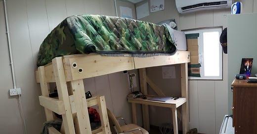
I’ve used PowerPoint to make custom icons for Google Earth for almost 15 years, in particular because I can churn out pngs with transparent backgrounds with ease.4 As I highlighted in the picture at the top of this post, I’ve used PowerPoint to design real-world construction projects like team loadout bays in Afghanistan and the loft bed with a desk that made my year as CHOPs a little more bearable.
PowerPoint does this well because it’s a poor man’s vector drawing program. Some of you might have no idea what that means.
Broadly, your computer has two ways to draw things: pixels and vectors — don’t @ me all you Minecraft voxel fans. Most of the time when you’re moving graphics around, they’re stored in little, tiny dots of color called pixels. When you stretch your image, those tiny dots grow to big boxes, and your image gets pixelated, which makes your briefs look crappy.
Alternatively, because computers are very good at math and data, you can draw things with vectors, which is essentially telling your computer to follow a complicated quadratic formula to draw whatever it is you want. This works great because if you zoom into the image, the details don’t get pixelated, the lines stay crisp and smooth. When you draw shapes and text in PowerPoint, it’s actually drawing vector shapes, not pixels.
I’m sure the graphic artists reading this are revolting at the idea of using PowerPoint as a drawing program. But you know who isn’t? Steve Leonard. A career military officer, and possible the most cuttingly insightful voice of the GWOT generation, Leonard drew Doctrine Man for 16 years across multiple postings and deployments. So, it shouldn’t have surprised me at all to see, on his signoff post, that he’d been using PowerPoint all this time.
Ok. That’s it. Just two actually productive ways to use PowerPoint, and probably not the way you have been using it either.
What do you think? Got another use? Send them my way.
Third Offset was a proposed strategy for the US to stay ahead of our competitors. It relied heavily on a data transformation we still haven’t made. The first two offset strategies are worth a read themselves, and standout examples of what good strategy can be.
Some examples of take aways include: a ‘How not to write OERs’ guide, a detailed explanation of a unit specific challenge in Oki, and a messaging product for a DV to share with our messaging back in the NCR.
My battalion S6 got pushback from SOCPAC when she asked them to install both on my computer. ‘What’s your commander need it for?’
‘Umm drawing shit?’ she replied.
Portable Network Graphics, or the JPG alternative you probably didn’t know existed.


Little unclear on your idea of the post-presentation take away. Can you give an example?