

X.7: Stop Using Pie Charts, Your Commander Doesn't Understand Them And Neither Do You
Guest post from Natalie Stone


Data visualization is the tricky, looks-easy-actually-isn't, skill that is essential for anyone working with data. This is an introduction to the fundamentals of visualizing data, particularly where our intuition most often steers us wrong.
The above is a phenomenon known as Anscombe's quartet. Each of the four graphs are obviously different from the others, but without the visualization, you would be sure they were actually all the same. Why? As it turns out, the four graphs have nearly identical metrics - for example, their averages and correlations are all the same.
Any time you are working with data, your work is fundamentally to collapse data into fewer points of interest, and this process always results in a loss of information. You must be able to identify if the information that is being lost is either important, or superfluous, to the decision at hand. No one would dream of sending an Excel spreadsheet to the commander without looking for insights in advance, but we also have to avoid inadvertently cutting out critical information as a side effect of our visualizations. If you were to discuss Anscombe's quartet without this visualization, the result would be your audience thinking all four datasets are the same - which would be exactly the wrong conclusion.
The bottom line of any data visualization is that context is everything. Without quality context, at best your communication will be ineffective or confusing. At worst, it can cause considerable damage to your audience’s ability to make the right decision.
Let’s look at some easy and effective ways to quickly improve any data visualization.
Avoid Clutter:

Maximize your data-to-ink ratio, meaning, maximize the amount of ink you use in the visualization that represents information, rather than a decoration. On the left, ink is used for unnecessary icons and labels. On the right, every bit of ink goes towards informing the audience.
Get Color Right:

Your color palettes need to match your intended interpretation. If you are wanting to show low to high values, for example displaying change over time, sequential colors are appropriate. Or, if you have a meaningful neutral point in your data, such as neutral sentiment, diverging colors are the best fit. If your data points are not ordered in any way, such as countries or languages, categorical colors allow viewers to recognize the distinction.
Consider minimizing your use of red / yellow / green color palettes as well. Without clear definitions, it’s challenging to know when a task should move from red to yellow to green (On time? On budget? Approval received? etc.). In this case, too much information has been collapsed for the palette to be meaningful. There are several alternatives, but the easiest is simply to use only one color - red - as an alert.
Stop Using Pie Charts:

Which one of the above charts is easiest to quickly interpret? While the human eye is excellent at interpreting straight lines, it struggles to accurately interpret angles and area. Pie charts might be more eye-catching than bar charts, but you do your audience a substantial disservice by trading clarity for aesthetics. 99.99% of the time, using a pie chart is the wrong choice.1
Order For Clarity:
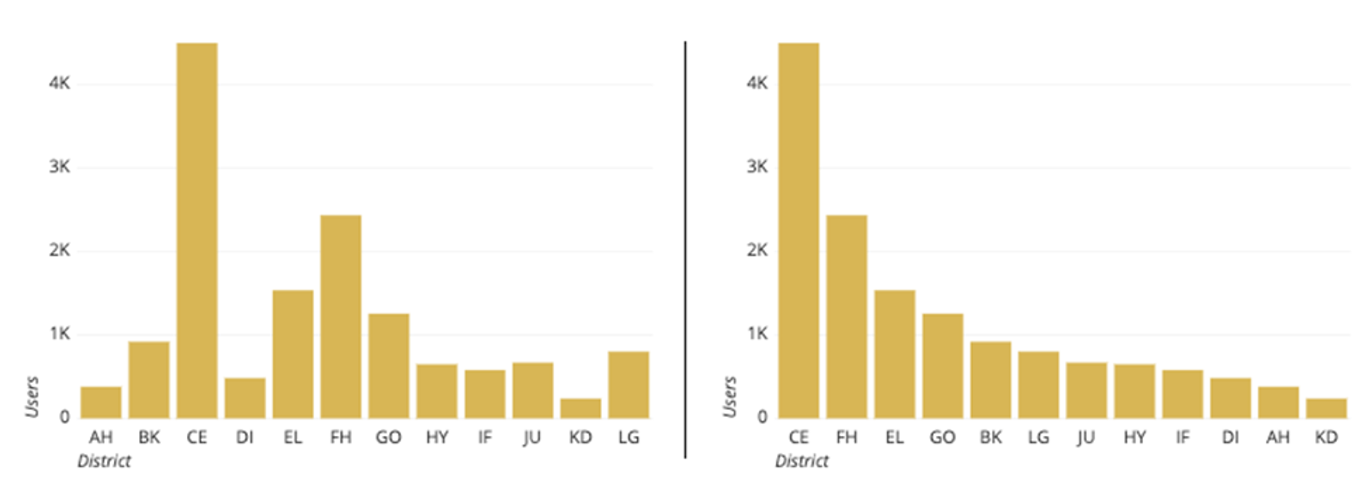
If the information in your chart does not require it to stay in a specific order, you should always apply an order that improves ease of interpretability. The chart on the left is only helpful in finding the tallest and shortest bars, whereas the chart on the right allows the viewer to compare any range of heights easily.
Don’t Break Your Axes:
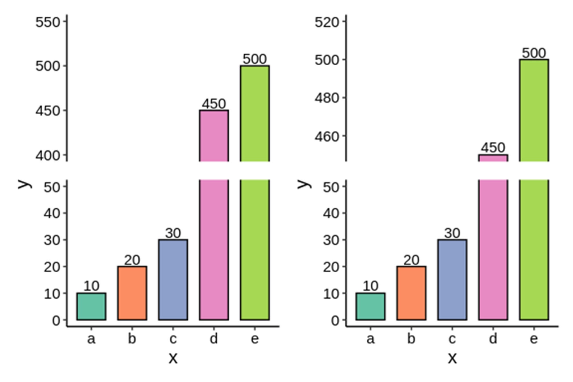
You may see the news or sports frequently do this because of the limited real estate on a TV screen - but it is almost always misleading. These two graphs show the exact same data and values. But, because the axis is broken in different places, it makes the value of bar d look different between the two graphs. Rule of thumb is to never use broken axes, especially with bar graphs.
A Tale of Two Visualizations
Data visualization is first and foremost about the story you want to tell. Is the story you want the audience to take away, the same story you believe you are communicating? Do you know where your blind spots are between what you are showing, and what your audience sees?
Let’s talk about two strikingly different visualizations. Only one of them gets their story right.

Gen. McChrystal famously quipped upon seeing this visualization, that “when we understand that slide, we’ll have won the war.”
What story is being told here? If the story is that the dynamics in Afghanistan are complex, the audience already knows that from firsthand experience.
Nothing in this visualization is highlighted, nothing is actionable, and there is no plot to follow. While it shows an impressive effort, if there ever was a story that needed to be told in this visualization, it was buried underneath the noise.

Every bit of data present in this visualization is used to illuminate one story: the complete disaster of Napoleon’s campaign of 1812.
The light grey line is French troops going into Moscow, and the black line is troops returning back to France. Most viscerally, the width of these lines represents the number of troops at that time in their journey.
It is worth taking some time to explore this visualization in detail (larger version here). Take a look at the temperature and geographic landmarks included, especially at the Berezina River near the black line.
It’s often said that good design is invisible, as it subtly guides the audience without drawing attention to itself. The story in the second visualization is clear, yet it offers deeper insights with each revisit, because the focus remains on the story, rather than the aesthetics. Poor design, on the other hand, makes itself obvious and distracts from the intent of the visualization. This is where the first visualization fails, since its purpose is obscured by a confusing tangle of names and networks.
This invisibility of good design is what underpins and connects all the concepts we’ve explored. How this should shape your own visualizations is clear: ask yourself, does this design make understanding effortless? If your visualizations prioritize clarity and context, over the temptation to impress with complexity or visual appeal, your work will always speak for itself.
Resources
Data-To-Viz: Select your type of data, its characteristics, and you can see guidance on what type of chart will best explain your data.
A Visual Introduction to Machine Learning: Well-designed visualizations for a technical deep dive into training and optimizing machine learning models
Rate Your Visualization: Helpful if you want an interactive checklist to review your visualization in advance
Storytelling With Data by Cole Nussbaumer Knaflic is a great read that helps with a lot of these things. I also recommend her children's book, Daphne Draws Data.