


2.09: Where Red Lives


I’m not certain when I first heard of a ‘dashboard’, but in late 2016 our group commander really wanted one. He wanted a single stop for information on dozens of metrics across the SF Group. He even invited a few industry heads to pitch us their ideas. All of them had four things in common: a glitzy PowerPoint that promised the world, no functional prototype, a price tag in the millions, and a wait time of years. Our commander wasn’t happy with the pitches, in no small part because they wouldn’t be delivered until after he was out of command.
So, he told the Group XO to just have the staff build him one themselves. From scratch. Inside six months.
We had an unmatched team at the group staff. Lee was crushing it in the S1, Ben and I were doing our S2/S3 roadshows, and Ryan was rowing hard in the S6. We also had Mike making a lot of magic happen in the S4 shop, and a different Mike who was ostensibly our civil affairs officer but was really a pinch hitter in a dozen different jobs. I I’ve never worked with that many top-tier field grades in a single headquarters since. Every one of us was subsequentially selected for battalion command. But we didn’t know a damn thing about making a dashboard.
Our XO, Steve, knew almost nothing about coding let alone dashboards, which is probably the only reason we actually managed to build one. If I had been in charge, I’m pretty sure I’d have just told the commander it was impossible and not bothered to try. I’d have been wrong, and worse, I’d have never learned one of the most important lessons I’d need for command.
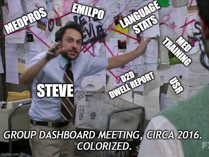
Over the next six months across a series of meetings with the whole staff, we painstakingly identified all the questions the dashboard should ask and where the respective data streams were, as well as what format it was in. Today the work would be described as building a data fabric, but ours would certainly have been more akin to something found in a thrift store. It was digital duct tape and chewing gum, and its diagram looked a lot like a Charlie Kelly conspiracy fever dream.
This is because the Department of Defense has way too many data systems, and none of them index off the same value. Most use some semblance of a soldier’s name. But is it ‘Last, First, MI’, or ‘Last First Middle’, or ‘Last, FI, MI’, or some other combo entirely?
Does every soldier, sailor, marine, guardian, and coastie have a unique index number? Yep.1 Did the databases use it? Nope. I have no idea why, but almost none of our databases use DODID. To rub salt in the wound, when the Army rolled out IPPS-A it unironically had everyone’s DODID in the data, but also invented a new additional index number for just IPPS-A to use.2
Next, for extra difficulty, we had the challenge of straddling systems that were on either NIPR or SIPR.3 We had to flow all the data streams up to SIPR regardless, because amalgamating that much data was inevitably going to elevate the classification. This was an unavoidable challenge, but it also led us to finding out the real power of what we’d built for the commander.
Most dashboards you see touted by various units in the army are just glorified pie charts at best. They depict the data, but not any real story. They’re typically just graphic depictions of the data. This is a step up from crappy charts on PowerPoint, but units are typically overpaying a contractor to make PowerBI charts the staff could figure out after a weekend of googling / YouTube / reddit. In the end, some part of all these charts is red. Red is bad.
Lots of units provide commanders lists of all the soldiers that are red on a myriad of arbitrary tasks. Who’s expired on language training? Who’s overdue for an evaluation? Who needs to submit a travel voucher? The PERSTAT we made when I was a BN XO generated reports like this automatically.
Units across the army try to track hundreds of things from mandatory inane training to mandatory critical training. You get slides with the same shade of red reporting who’s expired on one of eight different annual intel training courses next to another that’s showing overdue reports on lost or damaged equipment. There are pie charts for financial records reviews and hearing tests and vaccinations and periodic health assessments and dental cleanings and… this goes on and on. It’s hard to tell what matters when it’s just more red slices of pie on an unending stream of PowerPoint slides. And so many command teams just waste all their time chasing all the red, at the cost of real training, real mentoring, and real leadership.
For our unit, that changed when we took all the data threads and plugged them into the operational calendar. We were at the weekly command and staff and we were trying to brief the commander off the latest beta of our dashboard. He was getting increasingly agitated, partly because the dashboard was still mostly cardboard and bubblegum and partly because, like every other week, the red never seemed to be shrinking.
While we briefed him on the training status of our medics, the commander abruptly asked, ‘What cycle is his team in?’
Everyone stopped and looked around. I poked at my laptop and toggled the view to pivot the med training data by team and suddenly we all saw the ODAs sorted by readiness phase. The medic’s team was in its reset phase.4 As soon as the commander saw the team was in reset, he visibly relaxed, and then changed the subject with a dismissive ‘That’s where red lives’.
I’d worked for a dozen battalion commanders in the Army by then, and it was literally the first time I’d heard a commander say that. Usually, command and staff is an absurdist wiener dog race of companies trying to outdo each other as they chase red on slides. But with just that single sentence, my commander completely switched my paradigm. Red had a home, and it was in reset.
By connecting all those disparate streams into the ops cycle we could see the difference between a medic who had just returned from a year away and was expired because he should be from the medic that only had a month to get ready to deploy and had failed to get a critical certification.
In our unit’s case, when I filtered out all the teams in reset, over 50% of the red on the various pie charts disappeared. That may not seem so significant at first blush, but it meant half of the red we were chasing week in and week out was wasted effort. If a unit has enough time to do all the things the army wants to do, that’s still a massive time savings. Except no unit in the Army has that much time. Real units are drowning in an absurd level of administrative requirements. Giving red a home suddenly gave our unit the time we needed to get our head above water, to take a look and see what the actual priorities should be.
Ultimately, the dashboard didn’t last any longer than the country pages did. This time it was less about buy-in than it was about complexity. Our dashboard died under its own weight. It needed too many people who knew the intricacies of all the data pipes to keep it running, and as we all started to PCS, the new team couldn’t sustain it.
But I took with me those two critical lessons. The first was what we could do. We weren’t coders by any stretch, but a handful of data literate majors could build a dashboard, albeit an ugly one. More importantly we could innovate, create something new and better and fundamentally change the way our unit worked. The second lesson was the power of a commander who can tell his unit what not to do. I eagerly applied both lessons years later when I became a battalion commander.
DoD ID Number (DODID), also called a EDI-PI, or Electronic Data Interchange-Personal Identifier
Footnote: Integrated Personnel and Pay System - Army. A $10 billion dollar personnel system currently cosplaying as the wreck of the Titanic.
Non-classified Internet Protocol Router Network (NIPRNet) and Secure Internet Protocol Router Network. One is the everyday network for military functions, the other is more secure and reserved for classified information.
Units in the Army are always in one of three states: resetting, having just come back from employment; training, or getting ready to deploy; and ready to deploy or already deployed. These can be reduced to Red, Amber, and Green, or a RAG cycle, though every two years the Army invents a new name for it.
Fighting this fight…dashboards are “in vogue” and all want one, but have a hard time explaining why… :-)